Article 136 of the Taiwan Patent Act mandates that the scope of a design patent shall be interpreted based on the drawings, while the Specification may be taken into consideration when necessary. On the other hand, the Taiwan Patent Examination Guidelines expressly provide that the description of a design is a statement which assists in explaining the shape, pattern, color, or combination thereof of the design, including the ornamental features illustrated in the drawings, so that a person having ordinary knowledge in the technical field to which the design pertains can understand its content and apply the design accordingly. Furthermore, where the contents of the drawings include “portions to which no claim is made, such portions shall be specified in the Description of the Design. Accordingly, the drawings, as supplemented by the recitations in the Description of the Design, may serve to determine the scope of a design patent. If the contents of the drawings are not sufficiently clear or the recitations in the Description of the Design are not sufficiently definite, this may result in variation in the interpretation of the scope of the design and thereby affect the right of the patentee.
In a recent design patent invalidation case, the patentee, dissatisfied with the Board of Appeals' determination to revoke the decision of the Taiwan Intellectual Property Office finding the invalidation action groundless, filed an administrative litigation with the Intellectual Property and Commercial Court. During the litigation, the Court adopted an interpretation of the recitations in the “Description of the Design” that differs from the patentee's, and, on that basis, held that the design at issue lacks creativity.
The filing date of the design patent at issue is March 10, 2022. It relates to a design for a “label” as shown in Fig. 1 below. Its characteristic features reside in: portion A, in which the expressions “梅酒,” “ういすきー” (Japanese: whisky), and “WHISKY UMESHU” are depicted in a brush-stroke style; portion B, in which a plum is illustrated; portion C, in which the relatively larger characters “花の雨” and the two lines of smaller characters “国產青梅100%で造ったウイスキーベースの梅酒” are depicted; portion D, in which a pink petal is illustrated; and portion E, in which the layout of a still is illustrated.
Furthermore, Item 2 of the Description of the Design in Specification of the design at issue states that “among the contents illustrated in the drawings, the components constituting the indications, the type of alcoholic beverage, the warning statement, the recycling mark and the barcode are portions to which no claims is made.”
The invalidation petitioner submitted several exhibits in an attempt to prove that the design patent at issue lacks novelty or creativity and made the following arguments:
Exhibit 2 is online information published on December 7, 2021 ([https://shingroupcorp.com/products/shin-whisky-umeshu-plum-wine/](https://shingroupcorp.com/products/shin-whisky-umeshu-plum-wine/)). Since its publication date precedes the filing date of the design patent at issue, and since the overall appearance of the design patent is substantially disclosed in the publication, the publication constitutes a prior art.
Exhibit 3 is online blog material dated April 13, 2021, from the blog “閒閒小魚出遊中” ([https://kellyrosie12.com/post-000000000/](https://kellyrosie12.com/post-000000000/) or [https://kellyrosie.com/post-000000000](https://kellyrosie.com/post-000000000)). Since its publication date precedes the filing date of the design patent at issue and since the overall appearance of the design patent is substantially disclosed in the publication, the publication constitutes a prior art.
The pink petal pattern shown in Figure 4 is an image file from an image library made public on October 21, 2013 ([http://www.daimg.com/psd/201310/psd_37035.htm](http://www.daimg.com/psd/201310/psd_37035.htm)). Since its publication date precedes the filing date of the patent at issue, and since the pattern in the publication is corresponding to the pink petal design in the design patent at issue, the publication constitutes a prior art.
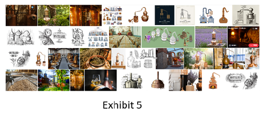
The still device illustrated in Exhibit 5 is an image file from an image library made public on March 29, 2018 ([https://www.shutterstock.com/zh-Hant/image-vector/alembic-still-making-alcohol-inside-distillery-0000000000](https://www.shutterstock.com/zh-Hant/image-vector/alembic-still-making-alcohol-inside-distillery-0000000000)). Since its publication date precedes the filing date of the patent at issue, and since the still device in the publication is corresponding to E portion of the design patent at issue, the publication constitutes a prior art.
 |
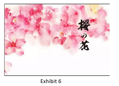
The inscription “櫻の花” and the pink petal pattern shown in Exhibit 6 are image files from a webpage made public on March 27, 2017 ([https://www.sohu.com/a/000000000_121346](https://www.sohu.com/a/000000000_121346)) (image file at [https://img.mp.sohu.com/upload/20170327/a53ed166b66a4cd4979a1e302591d418_th.jpeg](https://img.mp.sohu.com/upload/20170327/a53ed166b66a4cd4979a1e302591d418_th.jpeg)). Since its publication date precedes the filing date of the patent at issue, and since the pink petal pattern in the publication is corresponding to the pink petal in portion D of the patent at issue, the publication constitutes a prior art.
 |
With respect to novelty, the Court held that, in Exhibit 2 and Exhibit 3, the upper portion of portion C bears the larger-character inscription “信,” whereas in the design patent at issue, the upper portion of portion C bears the larger-character inscription “花の雨”; the two are different. Moreover, neither Exhibit 2 or Exhibit 3 discloses the ornamental feature of the pink petal in portion D or the still device in portion E of the design patent at issue. Accordingly, these two exhibits are insufficient to establish that the design patent at issue lacks novelty.
With respect to creativity, however, the Court held that, when the design patent at issue is compared with Exhibit 2 and Exhibit 3, the “WHISKY UMESHU” wording in portion A of Exhibit 2 and Exhibit 3 merely involves a simple change in placement (above and below the “梅酒” inscription). From a comparison between the design patent at issue and Exhibit 3, the design patent at issue merely reflects a simple change in the placement and number of the plum i in portion B of Exhibit 3. Further, from a comparison between the design patent at issue and Exhibit 2 and Exhibit 3, the larger-character “信” in Exhibit 2 and Exhibit 3 is simply changed to the larger-character “花の雨” in the design patent at issue.
Thus, although Exhibit 2 and Exhibit 3 do not disclose the ornamental features of the pink petal in portion D and the still device in portion E of the design patent at issue, online images as shown in Exhibit 4, Exhibit 5 and Exhibit 6 already disclose the pink petal in portion D, the still device in portion E, the inscription “櫻の花,” and the pink petal in portion D. Accordingly, a person having ordinary knowledge in the art to which the design pertains could, on the basis of these disclosures, arrange the still device in portion E as a relatively light background and, with simple positional adjustments, combine the pink petal in portion D into Exhibit 2 and Exhibit 3. Such simple method of changing the placement of elements is insufficient to render the overall design distinctive in its visual impression. Therefore, Exhibit 2 or Exhibit 3, or Exhibit 2 and Exhibit 3 in combination, can establish that the design patent at issue lacks creativity.
The patentee argued that “purely functional features” do not fall within the test of similarity, and mere indications of the type of goods, such as the front-label inscriptions “梅酒,” “WHISKY,” and “ういすきー”should be excluded from assessment. The patentee further argued that Item 2 of the Description of Design in the Specification of the design patent at issue already states that no claim is made to the type of alcoholic beverage and other items disclosed in the drawings, and therefore the inscriptions “ういすきー” and “WHISKY (whisky) UMESHU (plum wine)” should not be taken into consideration in assessing similarity
To the above effect, the Court found that, where the features of a design patent are decorative features that simultaneously possess functional and appearance-creation aspects and are capable of producing a certain visual effect, they are not purely functional shapes of an article or purely functional features, and accordingly must be included in the test of similarity. Thus, although the brush-stroke expressions “梅酒,” “ういすきー,” and “WHISKY UMESHU” in portion A of Exhibit 2, Exhibit 3, and the design patent at issue do serve the function of indicating the product, their character size and aspect ratio differ, and their arrangements are not entirely the same. It is therefore still possible to make formative/shape-creation variations in terms of the size, aspect ratio, and arrangement of “梅酒,” “ういすきー,” and “WHISKY UMESHU.” These elements are not “purely functional.”
Since Reference Fig. 1 of the design patent at issue merely illustrates the article to which the design is applied or the environment of use, it should not be taken to interpret the scope of the design of the design patent at issue. Accordingly, when Item 2 of the Description of Design recites that “among the contents disclosed in the drawings, the indications of ingredients/contents, the type of alcoholic beverage, the warning, the recycling mark, and the barcode are portions to which no claim is made,” a comparison with Reference Fig. 1 of the design patent at issue makes it clear that the “indications of ingredients/contents” and “type of alcoholic beverage” refer to the smaller-character indications on the left side, such as “Alcohol content: 15%,” “Main ingredients: plum wine base, whisky, sugar,” and “Product type: liqueur,” which do not fall within the scope of the design of the design patent at issue. By contrast, the brush-stroke expressions “梅酒,” “ういすきー,” and “WHISKY UMESHU” displayed in relatively large characters in portion A of the front view of the design patent at issue remain within the scope of the design patent at issue and constitute a basis for comparison in assessing similarity. The patentee's arguments were therefore not tenable.
If the drawings of a design for which a design patent is sought include both “portions to which claim is made” and “portions to which no claim is made,” such portions shall be presented in a manner that clearly distinguishes between them. For line drawings, the “portions to which no claim is made” shall be depicted in broken lines or other discontinuous lines (such as one-dot chain lines, two-dot chain lines, etc.), or rendered in grayscale. Where part of the design is represented by computer-generated drawings or photographs, the “portions to which no design is claimed” shall be shown, for example, in a semi-transparent tone. The manner in which such “portions to which no claim is made” are indicated shall also be set forth in the Description of the Design, as is expressly provided in the Taiwan Patent Examination Guidelines.
In view of the above, when preparing drawings for filing a partial design patent application, one may consider distinguishing the portions to which no design is claimed based on the foregoing provisions, so as to clearly define the scope of the design for which protection is sought. In practice, there are cases in which the label intended to be used on the product, or the packaging box to be marketed, is directly used as the drawings for the application. When this approach is adopted, the label or packaging will usually contain words or graphics that the applicant does not wish, or is not able, to have read into the claimed scope, such as indications of ingredients or materials, warnings, slogans, trademarks, descriptions, etc. For these portions lying outside the claimed design, since it is relatively difficult to depict them in broken lines, more often, they may be excluded by an express recitation in the Description of the Design. In such circumstances, whether these literal recitations are clear and definite becomes crucial. For example, in this invalidation case, it is not clearly specified in the statement “among the contents disclosed in the ‘drawings,' the indications of ingredients/contents, the type of alcoholic beverage…,” which figure is meant by the “drawings” so referred to. The Court could only, from the context before and after “the indications of ingredients/contents, the type of alcoholic beverage, warning, recycling mark and barcode,” and by comparing the drawings, determine that “drawings” actually refer to Reference Fig. 1, and on that basis interpret the scope of the design patent at issue. As an unclear manner of recitation may lead to different ways of interpreting the scope, and directly or indirectly affect the substantive scope of the right, this is something to which applicants should pay particular attention.